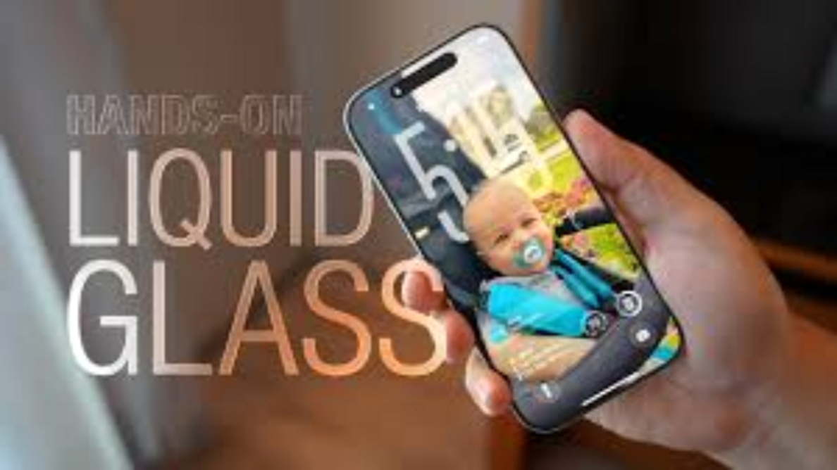

Apple has officially rolled out iOS 26, and the biggest headline feature isn’t just under the hood — it’s what you see every time you pick up your iPhone. The new “Liquid Glass” design has completely transformed the look of iOS, introducing a translucent, fluid, and highly dynamic aesthetic across the lock screen, home screen, and even core apps.
While visually stunning, this bold design choice has sparked a heated debate among iPhone users, designers, and accessibility advocates.
🎨 The Beauty — and Problem — of Liquid Glass
The Liquid Glass interface is all about transparency, rounded edges, and motion effects that give iOS a sleek, futuristic feel. But there’s a catch:
🔍 Clarity Issues – The translucency can cause text, buttons, and icons to blend with busy or colorful wallpapers.
👁️ Accessibility Concerns – Users with low vision or those who prefer higher contrast have reported that the interface feels harder to read, especially in bright environments.
Even though Apple refined the design after beta testing — adding more of a frosted effect — many users still want more control over how much transparency they see.
✅ How to Make iOS 26 More Readable
The good news? Apple has built-in tools to customize your experience. Here’s how you can fix clarity issues in minutes:
1️⃣ Reduce Transparency
- What it does: Makes menus and system elements more opaque, giving text a solid background.
- How to enable:
- Go to Settings > Accessibility > Display & Text Size
- Toggle on Reduce Transparency
- Result: Control Center, app menus, and sidebars become easier to read instantly.
2️⃣ Increase Contrast
- What it does: Darkens backgrounds and outlines UI elements for better visibility.
- How to enable:
- Go to Settings > Accessibility > Display & Text Size
- Toggle on Increase Contrast
- Pro tip: Use this with Reduce Transparency for maximum readability.
3️⃣ Pick a Smart Wallpaper
Your background can make or break the design. Choose:
- ✅ Minimal, solid colors → Better readability and less clutter
- ✅ Darker wallpapers → Strong contrast with white text
- ❌ Avoid overly bright or busy patterns — they make the interface harder to navigate.
⚖️ The Balance Between Style & Function
Apple’s Liquid Glass design is a bold step toward a more immersive iPhone experience, but it also shows how tricky it is to balance beauty with usability. Thankfully, the accessibility options in iOS 26 give users the freedom to personalize the interface — so it can be both elegant and practical.
For users who value clarity, these quick tweaks turn Liquid Glass from a potential headache into a design that truly shines.